


Phandroid
Android L vs Ice Cream Sandwich: Google Design shows off all new Roboto font [DOWNLOAD]
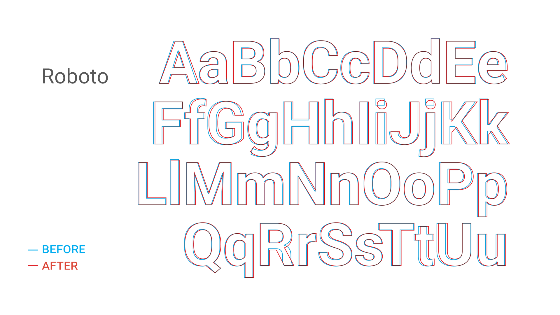
While not the kinda “graphy” that gets most people’s engines purring, there are few things in life we enjoy more than some good ‘ol typography. For Android L, Google decided to clean up the Roboto font we all love so much and saw introduced back in Android 4.0 Ice Cream Sandwich.
A few moments ago, Matias Duarte and friends took to the new Google Design Google+ page to show us the subtle difference coming to the typeface in Android L. While the differences aren’t anything too major (although Google says it’s been “extensively refined”), Google promises the font will look even better on the big screen (Android TV), the small screen (smartphones and tablets), and the really small screen (Android Wear smartwatches). You’ll notice a Roboto that’s a bit more round and wide, with the K R caps seeing the biggest changes.
Not shown in the comparison are the italics and numbers which also received some love, but if you’d like to check it out for yourself, you can download the all new Roboto font here. Enjoy.
0 comments:
Post a Comment